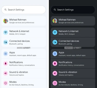
Gray, goodbye. A redesign with colored Settings icons is being tested for Android 16
The release of Android 16 in the final quarter of this year will bring about a number of changes, some of which you might not anticipate showing up in the settings configuration. We are talking about a very colorful redesign, not new options.
Google intends to unveil a new Material Design look at its developer conference next month, and the Settings menu—more especially, the colored icons—will be one of the changes we see.
The main Settings page, which is the first page you see when you launch the application, will display this icon change. In essence, colored icons are used in place of the existing gray or drab white ones.
This implies that the new design will now have circles of various colors surrounding the current plain gray icons without borders if you find them boring.
However, as Android Authority revealed , there are some inconsistencies with these icons, which don't seem to follow any kind of pattern in their color selection, so it looks like this is an experiment that's still in its early stages of development.
In fact, there are some icons, such as the parental controls icon, that haven't been changed yet, so it's unlikely we'll see this change in the icon redesign in the first version of Android 16, and it will be left for later updates.
Thanks to this change in redesigning the icons and giving them essentially unique colors, the user will be able to navigate not only by the names of the options but also by colors, making them much easier to manage without even having to read the text.


